8.10.2007

Seriously Worship Worthy

So okay I've been away a while. funny enough, today i got a lead on an amazing site and t-shirt collabo all rolled into one miracle, that roused me from my blogging hiatus like i'd seen a virgen maria on a tortilla.


Turns out this image is the newest fruit from the womb of the the Worship Worthy crew. Worhip Worthy is a newsletter and blog site by a group of smart style and culture saavy ladies in nyc. Their Frida t shirt above is a collabo with Rockers NYC.


On another note, Nomad’s summer lookbook has been up for a while on their site but I hadn’t posted about it.

This season I conceptualized, creative directed and styled the shoot – a lot more stress, but a lot more fun in the end.


The concept is called Tragic Fame and is centered on a single nameless male character obsessing and dressing up as 3 tragically “dead” style icons; Curt Cobain, JT Leroy, and Andy Warhol.


I wanted to play with the relationships between fame, dress-up, obsession and tragedy.

Have a look.

5.29.2007

Pretty Lights

One of the reasons I started this blog is that it affords me a place to curate instances of visual poeticism, at times in the most peculiar or abstract forms. Sometimes there are just no words to describe visual poetry, only the translation our eyes make scanning a picture, swallowing meaning.

I have to thank Jo for this picture she sent me. There isn't much to be said.. it just makes me swoon. I hope you like it too.


Ingo Mauer's installationa the Milan Furniture Fair.

4.25.2007

for the love of type

I honestly don't even know what to say about these. They are Jack Pierson's current exhibit at Regen Projects in L.A.


sigh.

4.21.2007

Donny Miller

One of my all time favorite graphic/artists Donny Miller recently hit Rodeo Drive with some street art a la marketing hoax. Pretty damn hilarious. You need to watch this clip.


(re-posted from Slamxhype)

Be sure to go to his website. I warn you though, you will want to lick his sexy, cheeky graphic illustration style. The current site has a feature on his cute book out "Beautiful People",

but in my opinion the juice is in the archived site here - from the flash intro that ends in a hand giving his name "Donny" a handjob (you'll see what i mean), to his "just add (googly) eyes" series here.


sigh.

3.10.2007

This One is for the Pisces

So this one goes out to the Pisces peoples. I have a special place for them in my heart, and I thought this image was simply magical.


The photo is an artist made "fish pond" in Russia.

reblogged from wooster

2.28.2007

A Revolution in Household Appliances


This is what I would call a revolution. What woman wouldn't do more housework if more household devices started *really* catering to women like this...


I mean maybe women's lib during the 60's missed the point all together. Forget trying to get men on their knees, like Cinderella that is, just bring on women's pleasure inducing household products!


To see more from Dominic Wilcox, the genius behind the orgasmatron washing machine, check out his site. I'd unknowingly seen his other work at Moss Gallery in New York last year. At the time, I was drooling over his War bowl pictured below. Yes, it is indeed made of litle plastic toy soldiers.


Furthermore, while looking at his site I also found that he'd made a lighting installation out of bic pens! Just as the Volivick chandalier did from a few posts ago.


Be sure to check out the rest of his work.


2.26.2007

New Creative

This last Saturday I worked with the brilliant minds of make-up and hair artist Elena Pacienza, and photographer Corey Goodyear again. They're both very experienced, very talented and all the while very down to earth. It's been quite refreshing to work with them and I consider myself blessed to have been taken under their wings, so to speak...

Here's a small dose of what we were up to most recently.


And yes, Robyn does look like Gwyneth Paltrow... she get's that *all* the time. Robyn is with Elite.

2.08.2007

shots i love.

Here are some more photos from the creative I styled a few weeks back.


One of the cheekier looks we did, this one reminded us of an anime character. I like the idea of making pretty girls look kind of dorky and eccentric. More interesting, I think. Her bow is made of a scarf I made. Sort of a neo-tie-dye thing.


This next picture was fun to get. Elaine has a dance background so we really wanted to catch her in some ballet motions.


Chanelling some beatnik, Jack Kerouac vibes.


wooly layers.


As you can probably tell, I'm in love with grey scale. But I also love the volt of colour here.


I've also been very fond of this headwrap/turban look since I first saw the Chloe ads for fall 06 last summer. And although they are making headway in a lot of collections, I've yet to see them worn in a fashion-conscious (as opposed to religious) way by real people outside of runways and magazines. Maybe in New York?


I hope you can see the detail in this next one. The best part of working on creatives, or just on set for that matter whether its video or photography, is the moment of revelation when you just get an idea you hadn't planned out and try it, and it works... I hadn't planneed this look out but it came together in a satirical way, I think. The entire look is "printed" on.


The top is a wings & horns shirt with printed suspenders and the pants are leggings with printed black jeans on them!

***********


There are more photos from the shoot I have to find, and I'll update this post as I get a chance.

Let me know what you think. It's been quite nice to hear back from folks who enjoy the blog in person, but I'd love to get a sense of your thoughts through the comments link...

cheers.

2.02.2007

Chandeliers to Write Home About


I'm a little late writing about this one as it circulated the blogosphere a few weeks ago now. Nonetheless, these transcend both the chandelier trend and, well, writing.


The Volivik Lamp by En Pieza is made of recycled bic pens, and reflects the kind of simple genius you wish you'd authored. Eco-friendly, clean lines, and proof that the art of re-appropriation can still be done in a way that's new.

The clear bic pen version (above) feigns the timeless chandelier form a little more closely, while the opaque yellow version suggests an air of late 60's. You know, shades of yellow and brown, circa wood veneer was chic.


2.01.2007

Earwaks.com Re-launch

My good friends over at Earwaks.com recently relaunched their online music and culture site. It's been an exciting venture and I'm very happy for them. For the launch they asked me to interview and write a story on the immensely talented Zaki Ibrahim.


You can read it here.

1.28.2007

Marianista Presents

A Sneak Peak of the latest creative


stay tuned, more to come...

1.06.2007

Feast your eyes on ribs of glass

Do yourself a favor. Visit Material Matters, the glass gallery at 501 Spadina just north of Queen. Perhaps you already walk past to revel in the rotation of glass beauties, ethereal sculptural creatures in a larger than life aquarium-esque storefront. But if you haven't you truly must, especially right now for Ione Thorkelsson's exhibit Ossuary 501.


The exhibit is a series of varying skeletal torsos, some of them with appendaged angelic wings, others verging on darker gothic, perhaps gargyle-ish shapes. The rib cage and spinal reconstuctions are quite breathtaking. Taking the delicacy of glass to emulate the grotesque fragility of what holds the body together Thorkelsson's pieces evoke awe at the sculptures themselves, but also at our own internal structure which seems to stare back at us, like strangely beautiful fragile armor.

12.06.2006

Jesu Cristo

Sometimes the level to which street art is taken is just downright sticky genius. Case in point: Jesu Cristo assembled out of sticky notes in Chile.


originally posted on Wooster

Nomad's Lookbook

The Nomad lookbook is live. check it.

12.05.2006

sneak peak


On Sunday I played stylist...

I'm very excited to see the all the photos go up any day now, on NOMAD's online lookbook...

stay tuned.

12.01.2006

Falling in Love


reblogged from Wooster

6.25.2006

au naturel

I just read an article reviewing the Abington (Pennsylvania) Art Centre's Sculpture Park. From what I understand the concept is installation art in natural (outdoor) space. The full article is at the Philly Inquirer. However, I just had to post this one picture.


Above is "Episalla's large scrim photographic mural printed on semitransparent vinyl mesh. Hung between two trees in the woods, the mural depicts a vastly enlarged color picture of the Grand Tetons that Episalla found in her late father's office"

As the article also points out, "[t]he mural will be interesting to see in November against a barren backdrop of leafless trees... but it's plenty amusing now". Indeed.

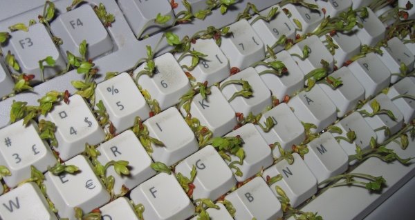
Very poetic, that mix of natural and human made when it's done just right. Similarly, thanks to the mavens at Eyebeam Reblog, I just found a site called Organisms: making art with living systems. Very interesting - most of it theoretically, more than visually but I like this one.


Cress growing in a keyboard.
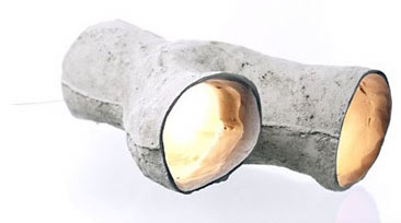
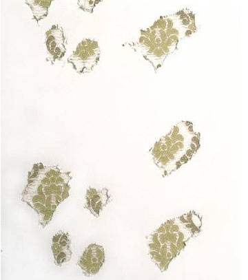
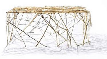
It reminds me of that Swedish all women design firm called Front. They credit a lot of their work to living animals that've assisted their designs. Like what?

Well, like snake hangers, that were sculpted by snakes coiling around logs of clay...


a mold of a rabit hole-made-lamp...


and rat wallpaper (made of the rat scratchings, turned into a repetitive pattern)


Also, in keeping with 'au naturel', coffee table made of branches


For more on Front Design check out IDO and Design Boom.

Picture Perfect

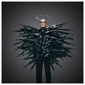
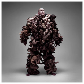
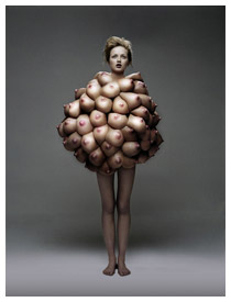
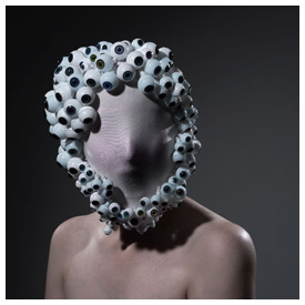
I've recently come across Philip Toledano, a photographer who's series entitled Hope and Fear makes very curious statements. Here's a selection from the series:


I find 'Hope and Fear' interesting because while the costumes are bizarre, infact bordering on silly, the facial expressions and lighting demand to be taken very seriously.


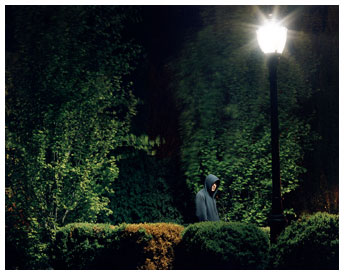
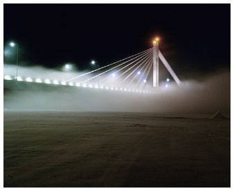
I also really enjoy his landscape and architectural shots from other series. As I browsed his multiple styles I was struck by the fact that I liked every one of them. I think it has alot to do with his use of cool color, but also with a kind of sophisticated tension in his lighting that is both dramatic, and calm or restrained. The following are from the set entitled Nightfall.


These are all best viewed within the context of their full series; visit Toledeno's site to get the bigger picture of his photographic brilliance.


And in a curatorial spirit, I invite you to view the following SPIKE JONZE short. I see it as a short, as opposed to, say, a new Adidas ad - but anyway... I think it works with Toledeno's photography. Not so much in subject matter, as in a kind of surreal, dreamy feeling. Also they use a similar range of cool colors, a pallette that makes me drool! (Notice how they match the steel grey of this page background. yup, basically my favorite color).

View the video here, but prepare for heartache over how sweet it is.