So how do you solve a problem like Maria? Well I'm 'a start up an online general admission journal. You might call it a “blog” but I won't. "Blog" is a word I despise which, actually, partially accounts for why I’ve waited so long to start one.
Subject to change, the kind of stuff I’ll be posting will include: “check this out: [insert something I think is dope]” entries, “these are a few of my favorite things” entries, “look what I made” lookbook pics and descriptions. And hey who knows, when I start feeling more comfortable with the idea of subjecting myself to public scrutiny- maybe even some “deep thoughts” ;) .
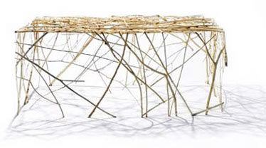
This week I stayed home from work after having my cervix excavated on Monday at Toronto Women’s College Hospital in search of pre-cancerous cells. It’s a rather common procedure, no worries there. But recovering gave me all this time to have art attacks all week. Case in point, below is step one of the chandelier I’ve been dreaming about for months. I finally bought a frame, and spray- painted it white. This proved to be a “learning experience” (as opposed to a “fuck up”), since I didn’t know you shouldn’t spray it outdoors when it’s windy. Anyways, it’s a good basecoat.
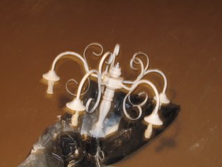
Okay, so it’s a work in progress. Next.
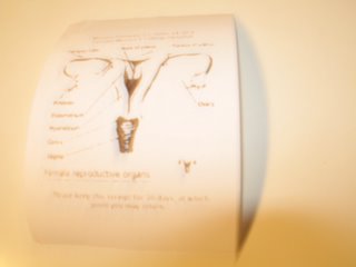
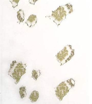
This is one of my cervix pieces. I basically made and printed out a receipt, on for-real receipt paper, for the procedure. It has a diagram of the female reproductive organs. On the top it has the date, and time of the surgery and the institution where it took place. Then on the bottom it says: “Please keep this receipt for 30 days, at which point you may return” – since 30 days is my total recovery time.

I also made a drawring, but I’m not as good of a drawrer as simon ;). It’s blurry but it's an 8x11 drawring of my repro orgs and there are two magnified boxes- and in the total close up of the cervix box I drew little cells, and some of the cells are little skulls.
I also made some necklaces today, but the digi ran out of batteries. I'll submit the evidence tomorrow. In the meantime, here are a few things I think are precious.
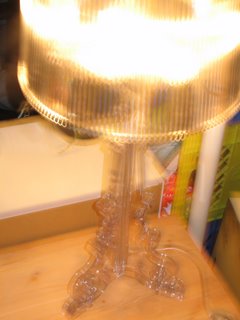
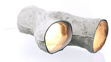
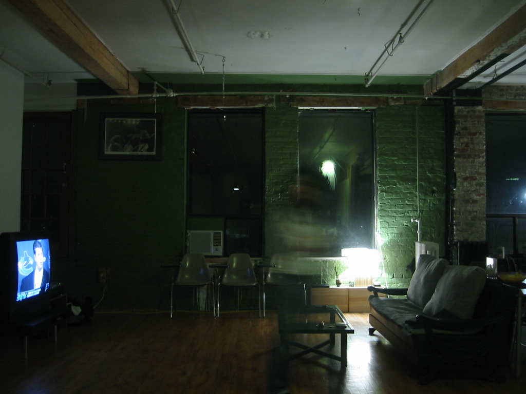
This is my favorite thing in my room, which means a lot because my whole apartment is my room.
I coveted it for so long and never thought I’d really own it.
It was a gift.
It is a beautiful lamp. (Thanks Jesar!)
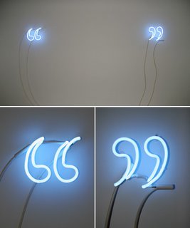
Below is a beautiful art piece I fell in love with and had to walk by and stare at through the window outside of Diaz Contemporary Gallery every other night when it was there. Being a writer, and a lover of contemporary art, and the general use of blue neon lights, well.. this piece makes my heart hurt.


 This is one of my cervix pieces. I basically made and printed out a receipt, on for-real receipt paper, for the procedure. It has a diagram of the female reproductive organs. On the top it has the date, and time of the surgery and the institution where it took place. Then on the bottom it says: “Please keep this receipt for 30 days, at which point you may return” – since 30 days is my total recovery time.
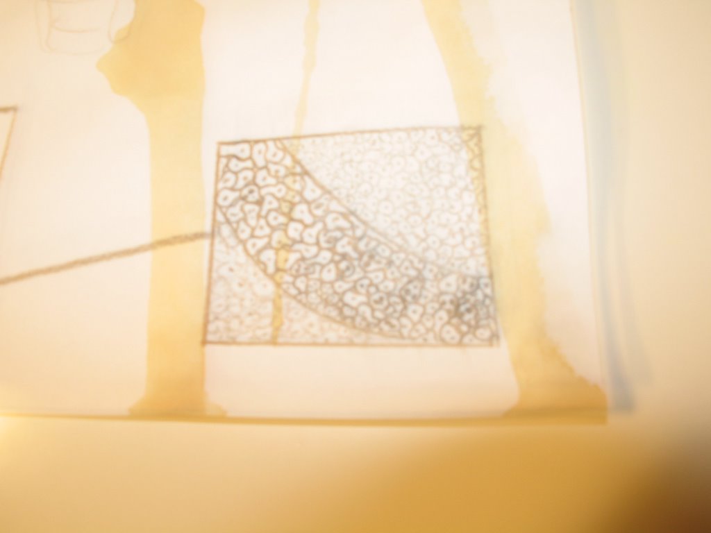 I also made a drawring, but I’m not as good of a drawrer as simon ;). It’s blurry but it's an 8x11 drawring of my repro orgs and there are two magnified boxes- and in the total close up of the cervix box I drew little cells, and some of the cells are little skulls.